
How data visualization can point the way to better sales numbers
The home heating oil and propane market is fiercely competitive. You win or lose business based on your ability to obtain and utilize market intelligence. This critical data comes from understanding your customer base and then using your industry knowledge to maximize efficiency and profitability.
Who makes up your customer base? Is it a specific demographic? The answer is typically the same across the energy industry. More than likely, your typical customer owns a home or a business that uses heating oil or propane for warmth or to operate equipment. You can identify customer trends by using reports, charts, and graphs. This is imperative when exploring new markets to expand your geographic footprint or for evaluating your current customers.
But have you looked at this data set geographically? One would argue that “where” is more important than “who” or “what” when it comes to your customer base.
Joe Pennesi of Davenport Energy (Chatham, VA) uses mapping “to visualize where our customers are by office location. When consolidating offices, we use the maps to ‘draw’ new boundaries to improve efficiency. In addition to that, we can rezone customers to reduce windshield time and increase number of gallons delivered.”
Another customer who is effectively using mapping as a strategic tool said, “We use the mapping functionality in [our management software] on a constant basis. Being able to see our customers by type and classification, in relation to our offices, has been a real eye opener. We’ve created more direct marketing campaigns using a geographic approach, rather than a broad brush which can cost an arm and a leg with postage.”
Pinning It Down
For most home heating and propane companies, customers are found in clusters. There may be a few outliers, but the bulk of customers are located within the same general area. This makes it easier to dispatch and route tickets to reduce windshield time and increase gallons delivered. These customers can be identified by running a few simple reports in your fuel management software.
However, looking at these customers geographically — on a map — brings another dimension into understanding your customer base. Depending on how detailed the classification and segmentation of your customers, visualizing them on a map will help you make better informed decisions about critical business steps such as expansion, marketing efforts to current customers, and improving market penetration where you are already doing business. Once you map your customers, the following questions might come up:
- Why do we have such a high density of customers in one part of town, but nowhere else?
- Is there a reason we have so many budget customers in this neighborhood? Could we be doing more?
- We’ve delivered double the number of gallons in this neighborhood compared to last year. Why is that?
- The map shows an increase of X% of new customers here. Did we run a marketing campaign to them? Can we duplicate it elsewhere?
- Our market share has really improved in this region. Is it worth opening a new office location?
- Our bulk tanks are much farther from our offices than they should be. Do we have other location options?
You’ll come up with more of your own questions. The point is, as soon as your data is mapped out you begin to see a picture that no report, chart, or spreadsheet could even begin to describe.
Understanding the New Picture
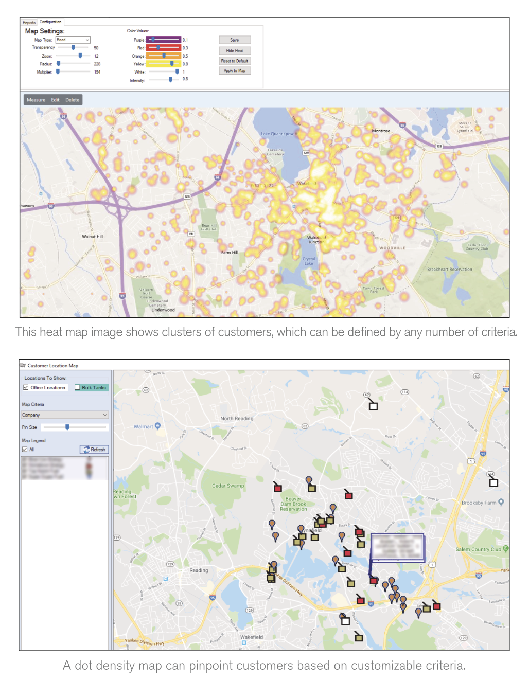
When you see your data geographically it can be overwhelming. First and foremost, you’ll want to ensure the data you are looking at is accurate. Make sure it aligns with the “columns” of information you get in a traditional report format. In addition, the type of map you are looking at is equally important. The two map types most software presents are heat maps and dot density maps.
A heat map (also known as a thematic map) represents data through color values. In most heat maps the color scheme is “hot to cold” where lighter colors show the lower ranges of data and darker, “hotter” colors show the higher clusters of data. Heat maps are an invaluable tool when it comes to looking at gallons delivered, sales and revenue numbers, or other data points that typically get aggregated up from the customer level. A best practice for a heat map is using it to gain insight on things you can’t physically see or touch. One advantage of heat maps is that you can set your value ranges and classification methods based on the size of your business.
When looking at location-based data or any variable you can physically see, dot density maps are the industry standard in data visualization. Push pins or icons will represent these variables and can be classified based on however your data is structured. Dot density maps truly depict the “where” of your customer base. Businesses can look for clusters that identify potential trends, competitive presence, and (most importantly) market share.
These maps can also uncover gaps in your data. There may be customers showing “off the grid” due to data inaccuracies, which cause a trickle-down effect to your bottom line. Customers with inaccurate geographical coordinates will affect your routing algorithms and cause potential problems for grouped deliveries. A single-digit geo-coding error could wreak havoc on your delivery or service fleet. Unless you know the exact coordinates of a specific address, these inaccuracies would never come to light in a report, chart of spreadsheet.
Whether you do under $1 million in sales or more than $100 million, maps are dynamic enough to allow you to pivot based on your data. When utilizing a heat or dot density map you’ll see where you’re doing the most business and which customers make up the most sales. Additional questions will also come up as to why your customers are concentrated in one area and not others. The more questions you can generate by taking this “bird’s eye” view, the more answers you will be able to generate that can help boost fuel oil, propane, equipment, and service sales.
Mike Procopio is the Inside Sales Manager at Blue Cow Software, an enterprise software platform developer working exclusively in the delivered fuels industry. He can be reached at mprocopio@bluecowsoftware.com.
